Difference between revisions of "Hubitat™ Dashboard"
| Line 4: | Line 4: | ||
#Load the Hubitat Dashboard App in the Hubitat Web Interface. | #Load the Hubitat Dashboard App in the Hubitat Web Interface. | ||
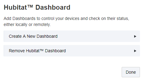
#Click on ''Create a New Dashboard'' | #Click on ''Create a New Dashboard'' | ||
| − | # | + | #:[[File:DB1.png]] |
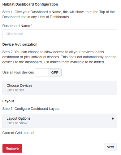
#Give your dashboard a name. This name will appear at the top of the HTML dashboard. Pick something descriptive such as the room this dashboard is controlling or its main purpose. | #Give your dashboard a name. This name will appear at the top of the HTML dashboard. Pick something descriptive such as the room this dashboard is controlling or its main purpose. | ||
| − | + | #:[[File:DB2.png]] | |
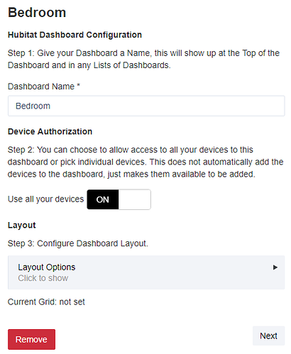
#Next, decide if you want to authorize all devices to the dashboard or just a select few devices. You can choose to use all devices by toggling the ''Use all your devices'' switch to ''On''. If you want to pick only a few devices, select ''Choose Devices'' and check the devices you want to see on your dashboard. | #Next, decide if you want to authorize all devices to the dashboard or just a select few devices. You can choose to use all devices by toggling the ''Use all your devices'' switch to ''On''. If you want to pick only a few devices, select ''Choose Devices'' and check the devices you want to see on your dashboard. | ||
| − | :[[File:DB3.png]] | + | #:[[File:DB3.png]] |
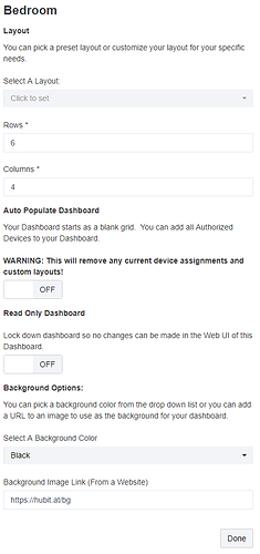
#Now pick your layout. If you want to use the default layout, just click ''Next''. Click the ''Layout Options'' button to configure grid to customize your dashboard layout. | #Now pick your layout. If you want to use the default layout, just click ''Next''. Click the ''Layout Options'' button to configure grid to customize your dashboard layout. | ||
::ADD SCREENSHOT | ::ADD SCREENSHOT | ||
Revision as of 16:22, 14 September 2018
Hubitat Dashboard gives you remote access to monitor and control your devices from your phone, tablet or desktop. This is a highly customizable dashboard that lets your choose the devices and layout you want to see. You can even set up multiple dashboards if you want to provide custom dashboards for each member of your house. Here's how to set it up.
- Load the Hubitat Dashboard App in the Hubitat Web Interface.
- Click on Create a New Dashboard
- Give your dashboard a name. This name will appear at the top of the HTML dashboard. Pick something descriptive such as the room this dashboard is controlling or its main purpose.
- Next, decide if you want to authorize all devices to the dashboard or just a select few devices. You can choose to use all devices by toggling the Use all your devices switch to On. If you want to pick only a few devices, select Choose Devices and check the devices you want to see on your dashboard.
- Now pick your layout. If you want to use the default layout, just click Next. Click the Layout Options button to configure grid to customize your dashboard layout.
- ADD SCREENSHOT
- Hubitat™ Dashboard uses a grid system for populating your devices in the dashboard. In the Layout Options section you can select one of the default grids or specify the exact number of Rows and Columns you want. Don’t worry; you can change all of this later, even in the actual dashboard interface.
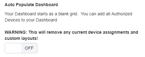
If you want all the devices you selected to be displayed on your dashboard, toggle on Auto Populate Dashboard. The dashboard automatically assign a tile for each device and place it on the dashboard. If you have more devices than grid spots, it will fill all the open spots and you can change them in the dashboard.
Once your dashboard is created, future devices can be added/removed devices in the dashboard itself.
Lock Down The Dashboard image
If you want to make your dashboard read only, meaning, it can’t be changed in the web view, you can toggle this on. If you need to unlock your dashboard you can always come back in here and flip this later. While setting up a new dashboard, you will want to leave this “off”.
Background Options image
Each dashboard has the option to specify a background color and a background image. Pick a background color from the drop down to your liking. The background image needs to be accessible to the client. We include a default “Hubitat” logo but you can change or remove this to your liking. These two options are also configurable in the Dashboard Interface, once we have set up the dashboard.
Go ahead and click “Done” and you will have your first dashboard installed. image
Notice you now have a “Dashboards Menu” which is a link you can click on and this will open a new window / tab. image
Bookmark this URL / Link as this is where you can access all your dashboards. Each dashboard has a Cloud and Local LAN Link. The Cloud Link allows your dashboard to be viewed from anywhere where the Local LAN link allows your dashboard to only be accessed on your home network. The Local LAN Dashboard will be faster to load and update. When you are on your local / home network, you will want to use this link.
Customizing your dashboard
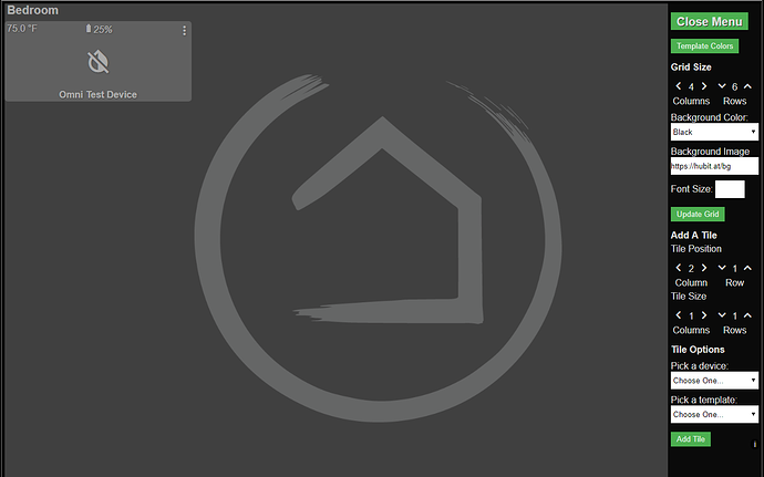
Let’s go ahead and click on the “Bedroom” Local LAN Dashboard (or whatever you named it). imageimage.png1301x885 45.5 KB This is the default / empty dashboard. If you had chosen the option: image
It would have been full of devices you authorized. Something like this: imageimage.png1300x888 192 KB Your devices will be represented here. You can customize each tile individually, more on that later. For now let’s assume you have a blank dashboard.
On the right hand side is the dynamic “Side Menu” that can change the Grid Layout Settings, Add, Edit or Remove Tiles.
Grid Size: Your dashboard is broken up into a Grid. This grid is defined by Rows and Columns. The default is based on what you picked when creating your dashboard. image
You can easily change the number of Rows and Columns by clicking the arrows next to each number. You will notice a real time preview of expanding or shrinking grid
You can also change the Background Color, Background Image and change the font size as well. image
There is a little “i” in the bottom right corner of the side menu that has a popup with your layout and devices. imageimage.png1300x444 91.7 KB Don’t forget to click “Update Grid” to save your changes and see them on the dashboard.
Add A Tile: image
This section allows you to add a tile anywhere in the grid. If you want a row at the bottom, or side, you can easily pick the Row and Column to add a tile. The defaults are going to always be the first available from Left to Right, Top to Bottom.
Also, each tile can “Span” Rows and Columns, allowing you to create larger tiles then the default 1x1 size. You can set the Span for the new tile now, or easily edit it later.
After you have picked your Tile Position and Tile Size optionss. The next area is to pick the “Tile Options” image
You have two main choices here. First is a “device”. This list contains all your authorized devices with initialized attributes. If a new device doesn’t show up here, remember to update the device in the device view so that a state / attribute is set.
There are two special “devices” called “Dashboards” and “Modes”.
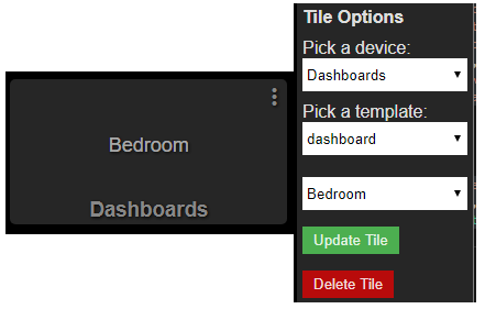
The “Dashboard” device allows you to pick any other dashboard you have configured and it will create a “dashboard” tile that when clicked, will take you to that dashboard.
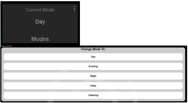
The “Modes” device allows you to create a tile that has the ability to display and select any mode for your location / hub.
Both these special “devices” must also be used in conjunction with their corresponding “template” called “dashboard” and “mode”.
If you chose any other device, you can then choose a “template” that would match the use case for that device.
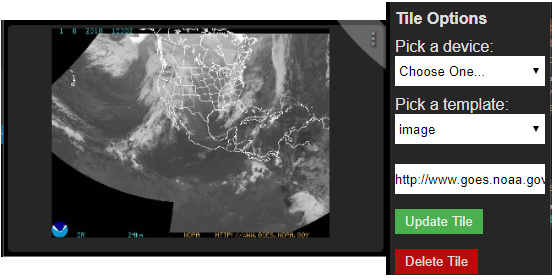
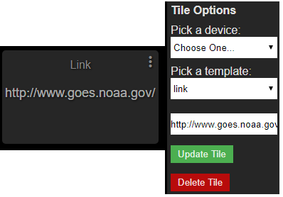
However, there are also some special templates that don’t require a choice of a device. These are “image” and “link”. Both of these will ignore the device selection, instead will show another input box that will allow you to paste in a link or a link to any image and that will be displayed in the tile. image
The rest of the templates are meant to match up with how you want to see the device in the tile. Some templates are single attribute focused. Like “battery” or “temperature”. These single attribute templates will just show that. Other templates are multi attribute capable and can show you more information or give you multiple options for control. For example, the “dimmer” template will give you the option to turn on/off the dimmer but also gives you buttons to dim up and down the dimmer.
Template Colors image The “Template Colors” button pops up a new area to pick colors for each Template and that template’s state(s). imageimage.png1221x225 19.9 KB Pick a template image
Pick a State image
Then pick a color for the Icon / Text Color and also for the tile background color for that state and click “Save Custom Color” image
image
Repeat for any other templates and states you want to change. These settings are saved in your layout.
NOTE: If you use the populate all devices in the Layout Section of the Child Dashboard App, you will remove your custom colors. This option can be used to reset your custom colors.
Add First Tile Pick one of your devices and a matching template and click Add Tile. You should now see your new tile at its specific row and column location in the grid.
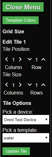
Notice how the Add A Tile section has now moved the Column count up, allowing you to add another tile next to the last one. Before we add more tiles, let’s look at how to Edit the tile we just added. Click “3 dot” menu button in the top right of each tile to open up the side panel and allow you to edit that tile.
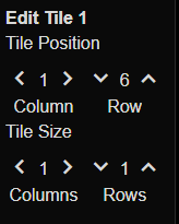
The menu will change to allow you to update the Row, Column and Spans, or pick a different device and/or template. You can then update the tile or click the Delete Tile button to remove that tile from the layout.
Let’s go ahead and move this tile to the bottom row. Click the up button next the row number until it is at the last row. Don’t worry; even though it allows you to click past the maximum number of rows, it won’t allow you to place a tile off the page. After you have set the row to its max, click Update Tile.
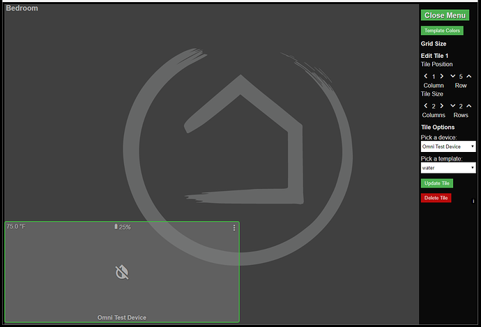
You have now placed a tile in the bottom left corner. You can place tiles anywhere you want. NOTE: Hubitat Dashboard will not prevent you from overlapping tiles. This can be useful in certain applications, but you can lose tiles you aren't careful so use this capability carefully.
Now lets edit that tile one more time, and move it up a row and set the size for both rows and columns to be two. image. This will result in a 2x2 tile like this:
As you can see, this grid layout is very flexible and allows precise placement of your tiles without the need to add spacers, and will not change regardless of the resolution of your device. This is a departure from other dashboard solutions out there, as they flow the tiles based on landscape or portrait modes.
You can create specific layouts for specific screens, devices, etc. In fact. You can even share your layouts with others or use that layout to create other dashboards based on that layout. Even restore your dashboards if something were to go wrong.
Advanced Options Heading back over to the Dashboard Child app. At the bottom of this screen you will have an option for Advanced Options.
You can adjust the Refresh Rate for the dashboard for cloud and local links. You can also set the Clock templates to display time and date in 24 hour and EU Date formats.
Layout Import / Export After you are done adding and editing your tiles, let’s switch back to the Dashboard “Child” app and go back in to the Layout Section.
You’ll notice a new option at the bottom called Import / Export Layout. Go ahead and click on that.
The “Import / Export” Layout section allows you to copy your current layout “json” code or paste in new “json” layout code and override your existing layout. WARNING: pasting code into the Import text box could break your dashboard. Make sure you have a copy of your current layout (above) before pasting in a new layout.
Once you have pasted in a different layout, tab out of the box and you will see this: image
This means your new layout is now imported. If not, restore your old layout or you might have to start a new dashboard and paste your backup into this.
You can share this layout “json” in the community or with others if you have designed a cool layout. Only your device IDs are stored in the layout, along with any images, links or dashboard IDs. It is pretty safe to share this, but if you want to edit the text, change each device Id to 1.
When importing someone else’s layout, exercise caution and realize you will need to update each tile with your own devices.
Overall, Hubitat™ Dashboard is a very powerful, fast Grid based Tile solution. We hope you enjoy using your dashboards. More tile templates are in the works and please provide your feedback in the community thread for dashboard tiles and we can see what we can do to accomodate your needs.
Helpful Hints:
Hubitat™ Dashboard has a built in refresh rate of 2 seconds for local lan dashboards and 5 seconds for cloud based links. You can adjust this in the Advanced Section of the Dashboard Child App.
The tile sends the command, but doesn’t assume it is changed until after we get a message back that the device state has changed. This can cause a small delay and a loading icon for your cursor and a slight fade out and back in of the tile when command is confirmed.
Templates:
Acceleration
This is a single use tile that displays acceleration status of any device with the acceleration attribute.
Attribute
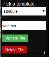
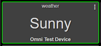
This is a custom tile that will display the text value of any attribute name. Just enter the name below the drop down.
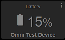
Battery
This is a single use tile that displays the battery status of any device with the battery attribute.
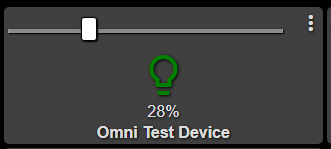
Bulb
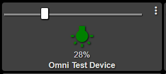
This is a multi use tile that displays the current state of the switch and level of a bulb. You can move the slider to change the level.
Button
This is a single use tile that uses a device that has one or more pushable Buttons. Once you choose the button template, you will then be able to enter the number of the button to send the pushed command.
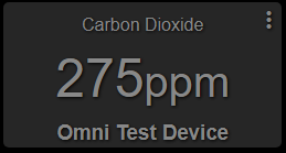
Carbon-dioxide
This is a single use tile that displays the reported carbon dioxide (CO2) levels in parts per million (ppm)
Carbon-monoxide
This is a single use tile that displays if Carbon Monoxide is detected or not. The green cloudy icon indicates the presence of Carbon monoxide as reported by the device.
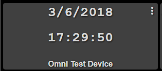
Clock-date
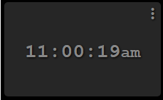
This is a special tile that displays your local browser time with seconds along with the current date.
Clock
This is a special tile that displays your local browser time with seconds.
Contact
This is a single use tile that displays the contact attribute of a device. Green means open, gray means closed.
Dashboard
This is a special tile that allows you to create a “link” to another dashboard on your current dashboard. This tile is smart enough to know if it is cloud or local based link based on what dashboard link is currently in use.
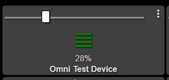
Dimmer
This is similar to the Bulb tile. Click to turn on/off the Dimmer and the arrow icons to change the level.
Door
This is similar to the Contact tile and indicates if a door is open (green) or closed (gray) to be used with the contact attribute of a device.
Door-control
This is similar to the Contact tile and indicates if a door is open (green) or closed (gray) to be used with the contact attribute of a device. Taping the tile will send the open or closed command after a confirmation dialog box.
Energy
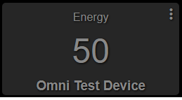
This is a single use tile that displays the energy attribute reported from the device.
Garage
This is a single use tile that displays the contact attribute closed is gray and pointing down, and open is green and pointing up.
Garage-control
This is a single use tile that displays the contact attribute closed is gray and pointing down, and open is green and pointing up.Taping the tile will send the open or closed command after a confirmation dialog box.
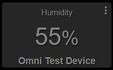
Humidity
This is a single use tile that displays the humidity attribute as a percentage.
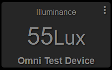
Illuminance
This is a single use tile that displays the light level in lux from the device.
Image
This is a special tile that allows you to insert a link to any image. This will be refreshed every 5 minutes. Once you choose the image template, a box will display allowing you to add the link.
Link
This is a special tile that allows you to create a clickable link to any website that will open up in a new tab. Currently, you can not rename the link. This will be added in a later version.
Lock
This is a multipurpose tile that shows the lock state and battery. Clicking on the lock will lock (green) or unlock (gray) the lock.
Mode
This is a special tile that will allow you to view the current mode and select a new mode for your hub / location.
Momentary
This is a single purpose tile that takes a device with the push attribute but will only send “on” (green) and it will return back to gray after the push command has been sent.
Motion
This is a multipurpose tile showing motion detected (green eye) or not (gray) and the values of the temperature sensor and battery level.
Multi
This is a multipurpose tile showing contact sensor open (green) or closed (gray) and the values of the temperature sensor and battery level.
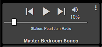
Music-player
This is a multipurpose tile allowing for control of the music player commands, play, pause, previous, next, mute and set volume. It also displays the current track information.
Outlet
This is a single use tile that turns on (green) or off (gray) the device via the switch attribute.
Presence
This is a multipurpose tile that shows the presence (green) or not (gray) of a device and the battery level.
Relay
This is a single use tile that shows the current state of a relay device. On is (green) and off is (gray). Taping the tile will send on/off.
Shades
This is a single use tile that shows the current state of a shade device. Open is (green) and closed (gray). Taping the tile will send on/off.
Smoke
This is a single use tile that shows if Smoke is detected by the device. The gray heart means everything is good, and the green “!” means smoke is detected.
Switch
This is a single use tile that shows the current state of a switch, on (green) off (gray) and you can click the tile anywhere to turn the switch on/off.
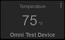
Temperature
This is a single use tile that shows the current temperature reported by the device assigned to it.
Water
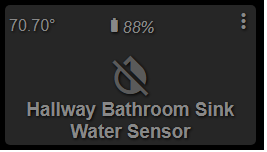
This is a multipurpose tile that shows a water sensor wet (green) or dry (gray) and the reported battery level and temperature
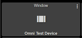
Window
This is a single use tile that shows the open or closed state of a window.
