Difference between revisions of "Hubitat™ Dashboard v1"
(Moved content) (Tag: Visual edit) |
(Temp update) (Tag: Visual edit) |
||
| Line 1: | Line 1: | ||
| − | |||
| − | + | Hubitat<sup>®</sup> Dashboard app is a powerful and fast, grid-based tile solution for local and remote access. You can quickly create highly customizable Dashboards to monitor and control your devices from a phone, tablet or desktop. Multiple Dashboards can be assigned to specific users, allowing a custom layout for individual or multiple users. A convenient QR code capture grants access for the assigned Dashboards on a per user basis. | |
| − | + | ===Installing Hubitat<sup>®</sup> Dashboard=== | |
| − | |||
| − | |||
| − | |||
| − | |||
| − | |||
| − | |||
| − | |||
| − | :: | + | #From the Hubitat Web Interface select '''Apps'''[[File:Install Built-In App 2.0.png|none|thumb|600x600px|link=https://docs.hubitat.com/File:Install_Built-In_App_2.0.png]] |
| + | #Choose the Hubitat<sup>®</sup> Dashboard from the list of Hubitat Elevation<sup>®</sup> Built-In Apps[[File:Install Hubitat Dashboard.png|none|thumb|600x600px|link=https://docs.hubitat.com/File:Install_Hubitat_Dashboard.png]] | ||
| − | + | ===Configure Dashboard App Menu=== | |
| − | |||
| − | |||
| − | |||
| − | |||
| − | |||
| − | |||
| − | |||
| − | |||
| − | ''' | + | *'''Dashboard Menu''' - Once you have your first Dashboard created, you will have a list of Dashboards for quick access here. You can switch between Local and Cloud links using the two tab buttons. |
| + | *'''Send Mobile App Link to Phone''' - This option allows you to text a link to someone to access the Hubitat<sup>®</sup> Dashboard Menu remotely.[[File:Create new dashboard.png|none|thumb|600x600px|link=https://docs.hubitat.com/File:Create_new_dashboard.png]] | ||
| − | + | ===Advanced Options=== | |
| − | ''' | + | *'''Remove Hubitat Dashboard''' - Selecting this button will remove the Hubitat<sup>®</sup> Dashboard app app. |
| + | *'''Allow new Dashboards to be created from Dashboard Menu -''' This option enables you to control if new Dashboards allowed to be created from the Dashboard menu. | ||
| + | *'''Use Legacy Dashboards?''' - Allows you to go back to Dashboard 1.0 rendering. '''NOTE:''' ''If you add any new template tiles, this could cause legacy Dashboards to not render.'' | ||
| − | + | ===Creating a Dashboard=== | |
| − | + | #Select ''Create a New Dashboard'' | |
| + | #Give your Dashboard a name. This name will appear at the top of the Dashboard. Pick something descriptive such as the room your Dashboard is controlling, or its main purpose. | ||
| + | #Under the '''Links''' section, you will find '''Local''' and '''Cloud''' links to your new Dashboard. These are standard Web URLs that you can bookmark to allow direct and easy access to your Dashboards. '''Local LAN Link''' is accessible inside your home, while on the ''same network'' and it features instant updates. '''Cloud Links''' are remotely accessible URLs that you can use to access your Dashboard from the internet, when you are outside your local network.[[File:New Dashboard.png|600x600px|link=https://docs.hubitat.com/File:New_Dashboard.png]] | ||
| + | #Under '''Advanced,''' you can set some options that affect the access to your Dashboards. | ||
| + | #*You can change how fast the Dashboard should refresh via cloud and local links. | ||
| + | #*You may set a Pin / Password to protect this Dashboard from loading. | ||
| + | #*You can set a numerical (numbers only ) PIN for Hubitat<sup>®</sup> Safety Monitor and for Modes. | ||
| + | #*It is also possible to disable access for this Dashboard from '''Cloud Links''' and/or from '''Local Links'''. | ||
| + | #*Lastly, you can set this Dashboard to “'''Read Only'''”, which will not allow any changes from inside the Dashboard app itself.[[File:Dashboard Advanced.png|none|thumb|600x600px|link=https://docs.hubitat.com/File:Dashboard_Advanced.png]] | ||
| + | #Next, decide if you want to authorize all devices to the Dashboard or just a select few devices. You can choose specific devices by disabling the '''''Use all your devices''''' switch. If you want to pick only a few devices, select '''''Choose Devices''''' and check the devices you want to see on your Dashboard. Limiting the devices in larger installs will speed up the loading of Dashboards. | ||
| + | #Choose “Done” and your first Dashboard is now installed. | ||
| − | + | ===Accessing Dashboards=== | |
| − | + | #Now that we have your first Dashboard set up, let’s head over to it. Choose the local link and open your new Dashboard in a new window. | |
| + | #You will now see the Getting Started dialog box, briefly explaining how Dashboard 2.0 functions.[[File:Getting Started Dashboard.png|none|thumb|678x678px|link=https://docs.hubitat.com/File:Getting_Started_Dashboard.png]] | ||
| + | #You have a couple options to get started. You can '''Manually Add Tiles''' (or just close this dialog) and get started, or you can select '''Auto Fill Grid''' and all your devices will be automatically added to the Dashboard with a default tile template. | ||
| − | + | ===Dashboard Builder=== | |
| − | + | #You can also use the new Dashboard Builder by selecting the link '''Dashboard Builder''' in the menu bar as shown below. Dashboard Builder allows you to create a Dashboard based on the devices you have authorized and their specific “attributes”. Select which ones you want to create, and you can then choose '''Build My Dashboard''' to create a quick and easy Dashboard that contains groups of each of these types of devices. | |
| + | #Both '''Auto Fill Grid''' described in the previous section, and '''Dashboard Builder''' will automatically optimize their default Grid Size for the browser you are currently using. It is best to use the browser and device you intend to normally use with Hubitat<sup>®</sup> Dashboards, so this automated process can build a Dashboard specifically for your device and choice of web browser.[[File:Dashboard Builder.png|none|thumb|600x600px|link=https://docs.hubitat.com/File:Dashboard_Builder.png]] | ||
| − | + | ===Add A Tile=== | |
| − | + | #Select the '''+''' icon in the top right to open the '''Add A Tile''' dialog. Here you can set the number of '''Columns''' and '''Rows''' by either using the '''-/+''' buttons, or clicking anywhere on the grid. | |
| + | #You can also change the tile '''Width''' and '''Height''' to set how big the tile will be. | ||
| + | #Next, '''Pick a Device''', then '''Pick a Template''', and finally set the '''Options''' for that template. | ||
| + | #Select '''Add Tile''' and you will see the tile added to your Dashboard in the spot you selected. The Grid will change to gray in that spot where your Dashboard now has a tile.[[File:Add a Tile.png|none|thumb|676x676px|link=https://docs.hubitat.com/File:Add_a_Tile.png]] | ||
| − | + | ===Edit Tile=== | |
| − | # | + | #You can edit any tile by clicking the 3 dot menu in the top right of any tile. This will open an editing window and allow you to move the tile around on the grid by selecting the '''-/+''' or by clicking the grid layout to move your tile to that position on the Dashboard. |
| − | # | + | #You can quickly jump between editing of tiles by using the back and forward buttons in the menu bar to either side of '''Edit Tile ID:''' |
| + | #You can change the '''Device''', the '''Template''' or any '''Options''' for the tile.[[File:Edit Tile.png|none|thumb|676x676px|link=https://docs.hubitat.com/File:Edit_Tile.png]] | ||
| + | #Selecting '''History''' in the menu bar will open up a window with a list of activities for that device from the event table.[[File:Device History.png|none|thumb|679x679px|link=https://docs.hubitat.com/File:Device_History.png]] | ||
| + | #If you want to remove the tile, press the '''Delete Tile''' button. | ||
| − | + | ===Settings=== | |
| − | # | + | #Selecting the gear icon in the top right opens up the '''Settings''' page for this Dashboard. |
| − | # | + | #There are 4 distinct options: Grid, Options, Templates and Advanced |
| − | # | + | #*'''Grid''' - You can change the grid size (columns and rows), font size, icon size, grid gap, as well as how rounded the corners are for all tiles. You may also paste in a URL for a background image, or set a color including a custom HTML value for the background of the grid.[[File:Options Grid.png|none|thumb|600x600px|link=https://docs.hubitat.com/File:Options_Grid.png]] |
| + | #*'''Options -''' Here you can change a variety of options for how your Dashboard will display (or will not display) information | ||
| + | #**'''Clock 12 Hour Mode (Turn off for 24 hour time)''' - Choose between 12 hour or 24 time display for any clock template or history | ||
| + | #**'''Date Format - S'''witch between '''MM/DD/YYYY''' and '''DD/MM/YYYY''' formats | ||
| + | #**'''Cloud and LAN''' '''Refresh Intervals - S'''et these to determine how fast the Dashboard will poll to show updates on screen. '''''NOTE:''' LAN refresh is only if a Dashboard can’t connect via websocket. When connected via websockets, updates should be immediate.'' | ||
| + | #**'''Column Width and Row Height -''' Remove these to auto fit tiles to the grid, or change these to specific values to force the Dashboard to render these tiles as fixed sizes, forcing the Dashboard to scroll if it overflows the browser window. | ||
| + | #**'''Allow Logo Click -''' Disable this if you don’t want to use this option as a means to return to the Dashboard menu. | ||
| + | #**'''Hide 3 dots -''' This will hide all the 3 dot menu at the top-right of each tile. You will need to re-enable the 3 dot menu if you want to edit tiles. '''''NOTE:''' This does not make the tiles read only, and the option can be still be set from inside the Dashboard App settings in the Hubitat Web Interface.'' | ||
| + | #**'''Hide Tile Template Names -''' This allows you to remove the names that are at the top of most templates. | ||
| + | #**'''Hide Icon Helper Text -''' Hides the text under each icon that indicates the attribute value. | ||
| + | #**'''Hide Device History -''' Used to remove the option to view device history in the tile details area. | ||
| + | #**'''Do Not Use Default Tile Colors -''' Turning this on will disable the default colors for templates.[[File:Options.png|none|thumb|600x600px|link=https://docs.hubitat.com/File:Options.png]] | ||
| + | #**** | ||
| − | + | ===Templates=== | |
| − | + | *In this section you can change the Color, Background Color and Custom Icons for each state available for a template.[[File:Templates.png|none|thumb|600x600px|link=https://docs.hubitat.com/File:Templates.png]] | |
| − | |||
| − | |||
| − | |||
| − | |||
| − | |||
| − | + | ===Advanced=== | |
| − | + | *'''Layout -''' This area allows you to copy and paste in layouts or make direct edits to your options, layout and custom colors. Quickly share custom colors or layouts using the code from this window.[[File:Advanced Layout.png|none|thumb|600x600px|link=https://docs.hubitat.com/File:Advanced_Layout.png]] | |
| − | + | *'''Devices -''' This area allows you to see a list of authorized devices, the current states and history (if enabled) for each device. This is helpful to troubleshoot if a device is reporting proper states. | |
| − | |||
| − | |||
| − | |||
| − | + | : | |
| − | |||
| − | |||
| − | |||
| − | |||
| − | |||
| − | |||
| − | |||
| − | |||
| − | |||
| − | |||
| − | |||
| − | |||
| − | |||
| − | |||
| − | |||
| − | |||
| − | |||
| − | |||
| − | |||
| − | |||
| − | |||
| − | |||
| − | |||
| − | |||
| − | |||
| − | |||
| − | |||
| − | |||
| − | |||
| − | |||
| − | |||
| − | |||
| − | |||
| − | |||
| − | |||
| − | |||
| − | |||
| − | |||
| − | |||
| − | |||
| − | |||
| − | |||
| − | |||
| − | |||
| − | |||
| − | |||
| − | |||
| − | |||
| − | |||
| − | |||
| − | |||
| − | |||
| − | |||
| − | |||
| − | |||
| − | |||
| − | |||
| − | |||
| − | |||
| − | |||
| − | |||
| − | |||
| − | |||
| − | |||
| − | |||
| − | |||
| − | |||
| − | |||
| − | |||
| − | |||
| − | |||
| − | |||
| − | |||
| − | |||
| − | |||
| − | |||
| − | |||
| − | |||
| − | |||
| − | |||
| − | |||
| − | |||
| − | |||
| − | |||
| − | |||
| − | |||
| − | |||
| − | |||
| − | |||
| − | |||
| − | |||
| − | |||
| − | |||
| − | |||
| − | |||
| − | |||
| − | |||
| − | |||
| − | |||
| − | |||
| − | |||
| − | |||
| − | |||
| − | |||
| − | |||
| − | |||
| − | |||
| − | |||
| − | |||
| − | |||
| − | |||
| − | |||
| − | |||
| − | |||
| − | |||
| − | |||
| − | |||
| − | |||
| − | |||
| − | |||
| − | |||
| − | |||
| − | |||
| − | |||
| − | |||
| − | |||
| − | |||
| − | |||
| − | |||
| − | |||
| − | |||
| − | |||
| − | |||
| − | |||
| − | |||
| − | |||
| − | |||
| − | |||
| − | |||
| − | |||
| − | |||
| − | |||
| − | |||
| − | |||
| − | |||
| − | |||
| − | |||
| − | |||
| − | |||
| − | |||
| − | |||
| − | |||
| − | |||
| − | |||
| − | |||
| − | |||
| − | |||
| − | |||
| − | |||
| − | |||
| − | |||
| − | |||
| − | |||
| − | |||
| − | |||
| − | |||
| − | |||
| − | |||
| − | |||
| − | |||
| − | |||
| − | |||
| − | |||
| − | |||
| − | |||
| − | |||
| − | |||
| − | |||
| − | |||
| − | |||
| − | |||
| − | |||
| − | |||
| − | |||
| − | |||
| − | |||
| − | |||
| − | |||
| − | |||
| − | |||
| − | |||
| − | |||
| − | |||
| − | |||
| − | |||
| − | |||
| − | |||
| − | |||
| − | |||
| − | |||
| − | |||
| − | |||
| − | |||
| − | |||
| − | |||
| − | |||
| − | |||
| − | |||
| − | |||
| − | |||
| − | |||
| − | |||
| − | |||
| − | |||
| − | |||
| − | |||
| − | |||
| − | |||
| − | |||
| − | |||
| − | |||
| − | |||
| − | |||
| − | |||
| − | |||
| − | |||
| − | |||
| − | |||
| − | |||
| − | |||
| − | |||
| − | |||
| − | |||
| − | |||
| − | |||
| − | |||
| − | |||
| − | |||
| − | |||
| − | |||
| − | |||
| − | |||
| − | |||
| − | |||
| − | |||
| − | |||
| − | |||
| − | |||
| − | |||
| − | |||
| − | |||
| − | |||
| − | |||
| − | |||
| − | |||
| − | |||
| − | |||
| − | |||
| − | |||
| − | |||
| − | |||
| − | |||
| − | |||
| − | |||
Revision as of 21:14, 30 October 2020
Hubitat® Dashboard app is a powerful and fast, grid-based tile solution for local and remote access. You can quickly create highly customizable Dashboards to monitor and control your devices from a phone, tablet or desktop. Multiple Dashboards can be assigned to specific users, allowing a custom layout for individual or multiple users. A convenient QR code capture grants access for the assigned Dashboards on a per user basis.
Contents
Installing Hubitat® Dashboard
- From the Hubitat Web Interface select Apps
- Choose the Hubitat® Dashboard from the list of Hubitat Elevation® Built-In Apps


Configure Dashboard App Menu
- Dashboard Menu - Once you have your first Dashboard created, you will have a list of Dashboards for quick access here. You can switch between Local and Cloud links using the two tab buttons.
- Send Mobile App Link to Phone - This option allows you to text a link to someone to access the Hubitat® Dashboard Menu remotely.

Advanced Options
- Remove Hubitat Dashboard - Selecting this button will remove the Hubitat® Dashboard app app.
- Allow new Dashboards to be created from Dashboard Menu - This option enables you to control if new Dashboards allowed to be created from the Dashboard menu.
- Use Legacy Dashboards? - Allows you to go back to Dashboard 1.0 rendering. NOTE: If you add any new template tiles, this could cause legacy Dashboards to not render.
Creating a Dashboard
- Select Create a New Dashboard
- Give your Dashboard a name. This name will appear at the top of the Dashboard. Pick something descriptive such as the room your Dashboard is controlling, or its main purpose.
- Under the Links section, you will find Local and Cloud links to your new Dashboard. These are standard Web URLs that you can bookmark to allow direct and easy access to your Dashboards. Local LAN Link is accessible inside your home, while on the same network and it features instant updates. Cloud Links are remotely accessible URLs that you can use to access your Dashboard from the internet, when you are outside your local network.
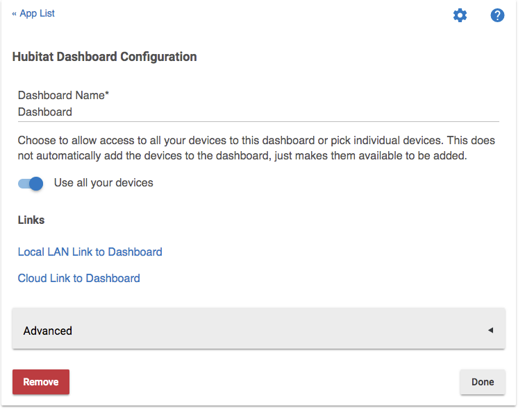
- Under Advanced, you can set some options that affect the access to your Dashboards.
- You can change how fast the Dashboard should refresh via cloud and local links.
- You may set a Pin / Password to protect this Dashboard from loading.
- You can set a numerical (numbers only ) PIN for Hubitat® Safety Monitor and for Modes.
- It is also possible to disable access for this Dashboard from Cloud Links and/or from Local Links.
- Lastly, you can set this Dashboard to “Read Only”, which will not allow any changes from inside the Dashboard app itself.
- Next, decide if you want to authorize all devices to the Dashboard or just a select few devices. You can choose specific devices by disabling the Use all your devices switch. If you want to pick only a few devices, select Choose Devices and check the devices you want to see on your Dashboard. Limiting the devices in larger installs will speed up the loading of Dashboards.
- Choose “Done” and your first Dashboard is now installed.


Accessing Dashboards
- Now that we have your first Dashboard set up, let’s head over to it. Choose the local link and open your new Dashboard in a new window.
- You will now see the Getting Started dialog box, briefly explaining how Dashboard 2.0 functions.
- You have a couple options to get started. You can Manually Add Tiles (or just close this dialog) and get started, or you can select Auto Fill Grid and all your devices will be automatically added to the Dashboard with a default tile template.

Dashboard Builder
- You can also use the new Dashboard Builder by selecting the link Dashboard Builder in the menu bar as shown below. Dashboard Builder allows you to create a Dashboard based on the devices you have authorized and their specific “attributes”. Select which ones you want to create, and you can then choose Build My Dashboard to create a quick and easy Dashboard that contains groups of each of these types of devices.
- Both Auto Fill Grid described in the previous section, and Dashboard Builder will automatically optimize their default Grid Size for the browser you are currently using. It is best to use the browser and device you intend to normally use with Hubitat® Dashboards, so this automated process can build a Dashboard specifically for your device and choice of web browser.

Add A Tile
- Select the + icon in the top right to open the Add A Tile dialog. Here you can set the number of Columns and Rows by either using the -/+ buttons, or clicking anywhere on the grid.
- You can also change the tile Width and Height to set how big the tile will be.
- Next, Pick a Device, then Pick a Template, and finally set the Options for that template.
- Select Add Tile and you will see the tile added to your Dashboard in the spot you selected. The Grid will change to gray in that spot where your Dashboard now has a tile.

Edit Tile
- You can edit any tile by clicking the 3 dot menu in the top right of any tile. This will open an editing window and allow you to move the tile around on the grid by selecting the -/+ or by clicking the grid layout to move your tile to that position on the Dashboard.
- You can quickly jump between editing of tiles by using the back and forward buttons in the menu bar to either side of Edit Tile ID:
- You can change the Device, the Template or any Options for the tile.
- Selecting History in the menu bar will open up a window with a list of activities for that device from the event table.
- If you want to remove the tile, press the Delete Tile button.


Settings
- Selecting the gear icon in the top right opens up the Settings page for this Dashboard.
- There are 4 distinct options: Grid, Options, Templates and Advanced
- Grid - You can change the grid size (columns and rows), font size, icon size, grid gap, as well as how rounded the corners are for all tiles. You may also paste in a URL for a background image, or set a color including a custom HTML value for the background of the grid.
- Options - Here you can change a variety of options for how your Dashboard will display (or will not display) information
- Clock 12 Hour Mode (Turn off for 24 hour time) - Choose between 12 hour or 24 time display for any clock template or history
- Date Format - Switch between MM/DD/YYYY and DD/MM/YYYY formats
- Cloud and LAN Refresh Intervals - Set these to determine how fast the Dashboard will poll to show updates on screen. NOTE: LAN refresh is only if a Dashboard can’t connect via websocket. When connected via websockets, updates should be immediate.
- Column Width and Row Height - Remove these to auto fit tiles to the grid, or change these to specific values to force the Dashboard to render these tiles as fixed sizes, forcing the Dashboard to scroll if it overflows the browser window.
- Allow Logo Click - Disable this if you don’t want to use this option as a means to return to the Dashboard menu.
- Hide 3 dots - This will hide all the 3 dot menu at the top-right of each tile. You will need to re-enable the 3 dot menu if you want to edit tiles. NOTE: This does not make the tiles read only, and the option can be still be set from inside the Dashboard App settings in the Hubitat Web Interface.
- Hide Tile Template Names - This allows you to remove the names that are at the top of most templates.
- Hide Icon Helper Text - Hides the text under each icon that indicates the attribute value.
- Hide Device History - Used to remove the option to view device history in the tile details area.
- Do Not Use Default Tile Colors - Turning this on will disable the default colors for templates.


Templates
- In this section you can change the Color, Background Color and Custom Icons for each state available for a template.

Advanced
- Layout - This area allows you to copy and paste in layouts or make direct edits to your options, layout and custom colors. Quickly share custom colors or layouts using the code from this window.
- Devices - This area allows you to see a list of authorized devices, the current states and history (if enabled) for each device. This is helpful to troubleshoot if a device is reporting proper states.
